Navigation auf uzh.ch
Navigation auf uzh.ch
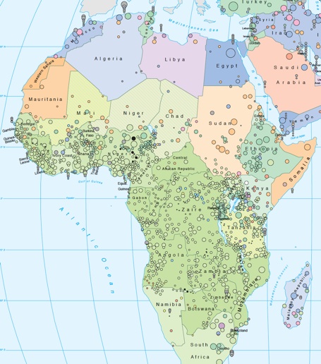
The two maps below display the same variable (traditional Agro-Technical Development – ATE) in different ways:
Since ATE is a one-dimensional ranked index (➔ ATE), one can read it in terms of „more“ and „less“ on both levels, the local and the national. To view the entire maps, click on the extract.
The ATE-diversity within countries which clearly comes to light in the point map is leveled out in the country map. While the point maps reveal regional patterns across and within country borders, the country map allows for international comparison. However, country scores are particularly deficient when countries are large (like India or China) and internally differentiated (e.g. Sudan). Since the proportion of the population is a weighting factor, country values are reflecting the cultural scores of big units more than those of smaller units (an extreme example: ➔ Discussion Egypt).
The African case is a good example for what gets won and what gets lost by aggregating local data up to the national level. For instance, the concentration of low intensity agriculture around the Gulf of Guinea due to intense equatorial forest is beautifully reflected in the country map. Also clearly visible are the Mediterranean belts in the north and – less so – the south.
On the other hand, the small belts of intensive agriculture (green points) from north to south in the (malaria-free) Eastern Highlands and also from east to west in the Sahel contrast with both: the forest areas with simple agriculture and the dry zones with (in the North) irrigated agriculture. These features are more clearly visible in the point map.
Finally, the one-dimensional ATE-Index should be compared with the map of subsistence types. Though the types also reflect intensity and productivity of agriculture, they are distinguished more by qualitative criteria, e.g. sedentary versus nomadic production.

In either case, large local units determine the color more than smaller units.
Leveling out and obliterate regional distinctions within countries is a feature of all international indicators and common practice in cross-national and econometric analysis. However, comparing country maps with maps of local cultural units allows for a view below the national surface.